I went through creating a new avatar the other day…
… and here’s what I found.
- The account creation dialogs on the website are okay, but:
- they still don’t make it clear that you cannot change your account name and don’t offer you the option to customize your display name at registration time… Action: ask for your preferred DISPLAY name, then munge it to create an acceptable account name as a second step.
- There’s no email validation step – this seems like a bad idea. Action: add one.
- You don’t have to retype your password, combined with no email validation, this is realllly bad. Â Action: require retype.
- BTW, I chose a nice one-word avatar name “Alemayehu” which, according to behindthename.com means “I have seen the world” in Amharic.
- Avatar selection
- The carousel is a nice idea, but it doesn’t work terribly well (the animations glitch or fail on various browsers).
- Why only three categories? Â and why would “Vampires” make it as a category, especially when half the avatars in the section are clearly not vampires? Action: more categories. Â Maybe a set of dialogs or a hierarchy.
- What happened to the black avatars? I chose an African name and the only remotely African looking male avatars are.. monsters which are more or less racist caricatures of black men?! I know there used to be a pretty decent black male in the library, but he’s not in the “Classic” section. Action: expose more library avatars at the signup phase.
- Best practice would be to either offer a very small number of generic avatars and do an appearance modification exercise in-world or run through a more involved dialog during setup… or maybe let you select a “starter avatar” from a new marketplace section and have it pre-applied?
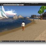
- Learning Island
- Build is acceptable, but needs more environmental effects and music. Â It DOES have some very very repetitive wave sounds at the landing point, but otherwise is dead dead dead: no animal sounds, no wind, the fountains are silent. Action: this is the very first environment a new user sees. Â Make it GREAT.
- Few indicators of what you are supposed to do. Â Arrows point the direction (fine), but some instruction is really required. Â There are hints that instruction is supposed to happen as popups: Â once an empty window popped up on the right side of my HUD, but… well… it was empty and soon went away. Action: fix the popups, make things work.
- A few minutes in, I was told that there was a new version of the viewer and offered to install it for me – it did, which was nice and fast, but I couldn’t log back in immediately, which was unexpectedly annoying.
- Social Island
- wait… we’re done learning already?!? Â Action: basic training should include touch and sit, use a dialog, chat something, maybe some basic inventory manipulation before sending them to a social space open to anyone.
- landing point crowded with avatars, mostly not new, some dancing and waving stuff around. Â At least they were chatty and seemed willing to answer questions.
- … which is good because there are no indications where to go and what to do.
- The Mesh Avatar
- First thing I noticed is that it doesn’t move anything like it moved in the avatar selection carousel on the web page. Â Not only no AO, but still the same old horrible default animations. Action: all starter avatars should be animated like the carousel.
- This guy seems to be almost unmodifiable and there aren’t any clues as to what you need to do to customize, including what clothing you need to look for. Action: starter avatars need to be customizable or they undercut one of the major selling points of SL (shopping, personalization, expressiveness).
